Lincoln Black Label
Concierge Mobile App
Lincoln Black Label Concierge App Redesign
The Lincoln Black Label app serves as a digital concierge for Lincoln dealerships across the United States. Designed for use on a dedicated tablet housed within a kiosk, the app interfaces with a DigitalB media device, enabling dealers to showcase detailed information and videos related to their Black Label trim vehicles. Initially configured for landscape viewing on a specific 9.7" iPad model, the app required a device ID for connection to dealership screens, limiting its versatility and accessibility.
To comply with my nondisclosure agreement with Eview 360 and DigitalB, I have omitted and/or obfuscated confidential information in this case study. All information in this case study is my own and does not necessarily reflect the views of The Lincoln Motor Company.
Detailed design files can be reviewed live during an interview process upon request.
Mobile Optimization
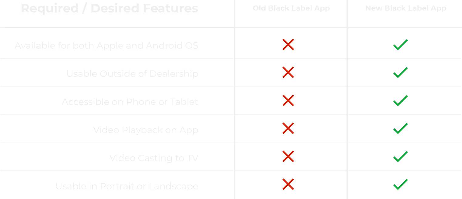
We embarked on a mission to transform an iPad-exclusive app into a versatile mobile experience, compatible with all smartphones and tablets released or announced by December 2018. Our goal was to redesign and redevelop the app to ensure seamless functionality in both portrait and landscape orientations, supporting Android OS 8 or later and iOS 11 or later.
A Complete Overhaul
The task at hand required a complete overhaul of the previous iPad-only version. While maintaining the aesthetic integrity of the Lincoln brand, we had to rethink the design approach from scratch. My role was pivotal in ensuring that the new design not only catered to the addition of several features but also enhanced the user experience for both dealers and customers.
Research and Empathy
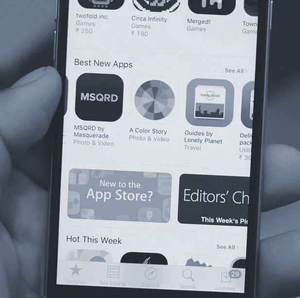
My journey began with a thorough investigation of similar vehicle or dealer apps, identifying three that provided valuable insights for our project. This research, coupled with casual interviews, laid the foundation for creating a user persona that embodied the needs and preferences of our target audience.
Analogous Research
Understanding User Needs
Feedback from a Lincoln dealer revealed key user requirements:
- Intuitive navigation by vehicle or theme
- Easy access to comprehensive Black Label vehicle information
- Capability to watch videos on various devices
- Compatibility with different smartphone sizes and brands, primarily in portrait mode
Our User Persona
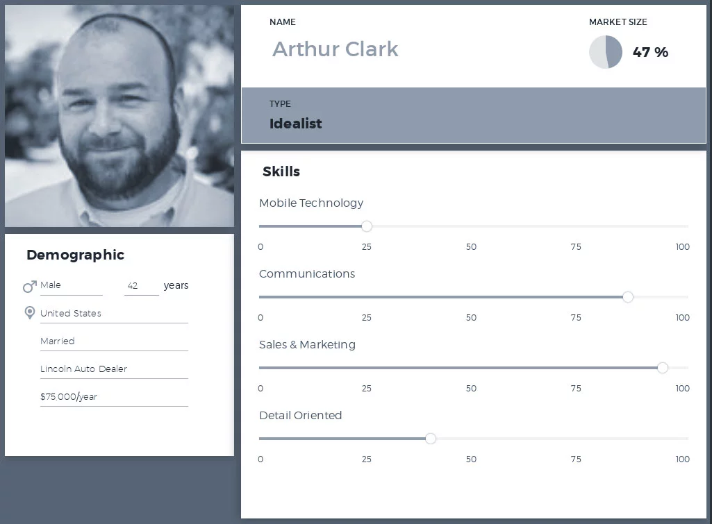
App Requirements
Structuring the App
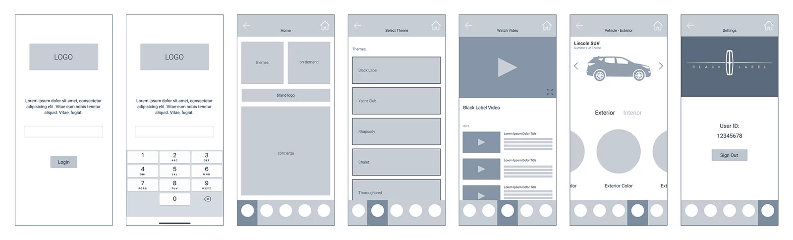
The ideation phase was crucial in establishing the app's basic structure. I developed wireframes that presented the information architecture of the revised phone layout, setting the stage for the visual design and content integration.
Wireframes
Upholding the Lincoln Brand
The challenge of selecting fonts and colors was alleviated by the predefined Lincoln brand guidelines. My focus was on adapting these elements to a smaller viewport while maintaining brand consistency. Inspired by the darker themes and neutral colors found in similar apps, I aimed for a clean aesthetic that highlighted the brand's primary color for a cohesive design.
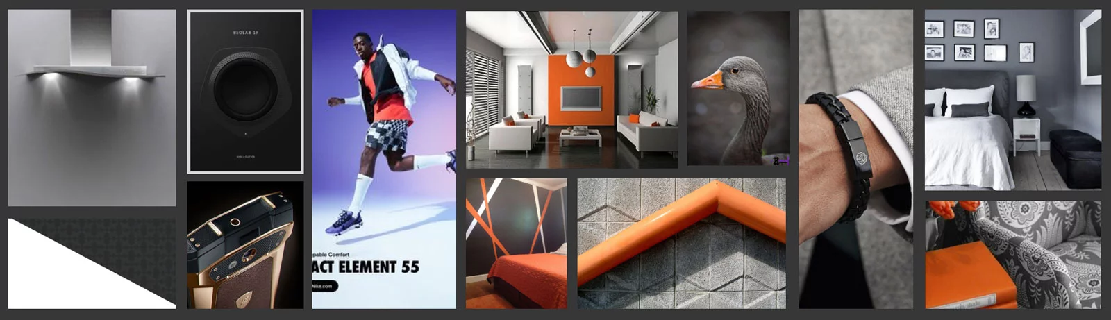
Embracing the Warmth of Orange
A brief analysis of Lincoln's brand colors revealed the warm and inviting nature of orange. This color choice was instrumental in creating a mood board that captured the desired style and feel for the app, ensuring it appealed to a broad audience.
Mood Board
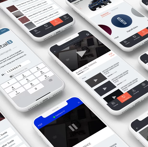
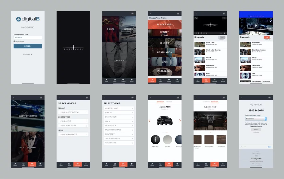
Designing the User Experience
The culmination of my research and analysis was the meticulous design of each screen and visual element. I employed patterns, spacing, and color to guide the user through the app, incorporating interactive elements that provided a natural and intuitive response.
Usability Testing (Prototype)
This prototype was originally created in Sketch and captured using a desktop computer
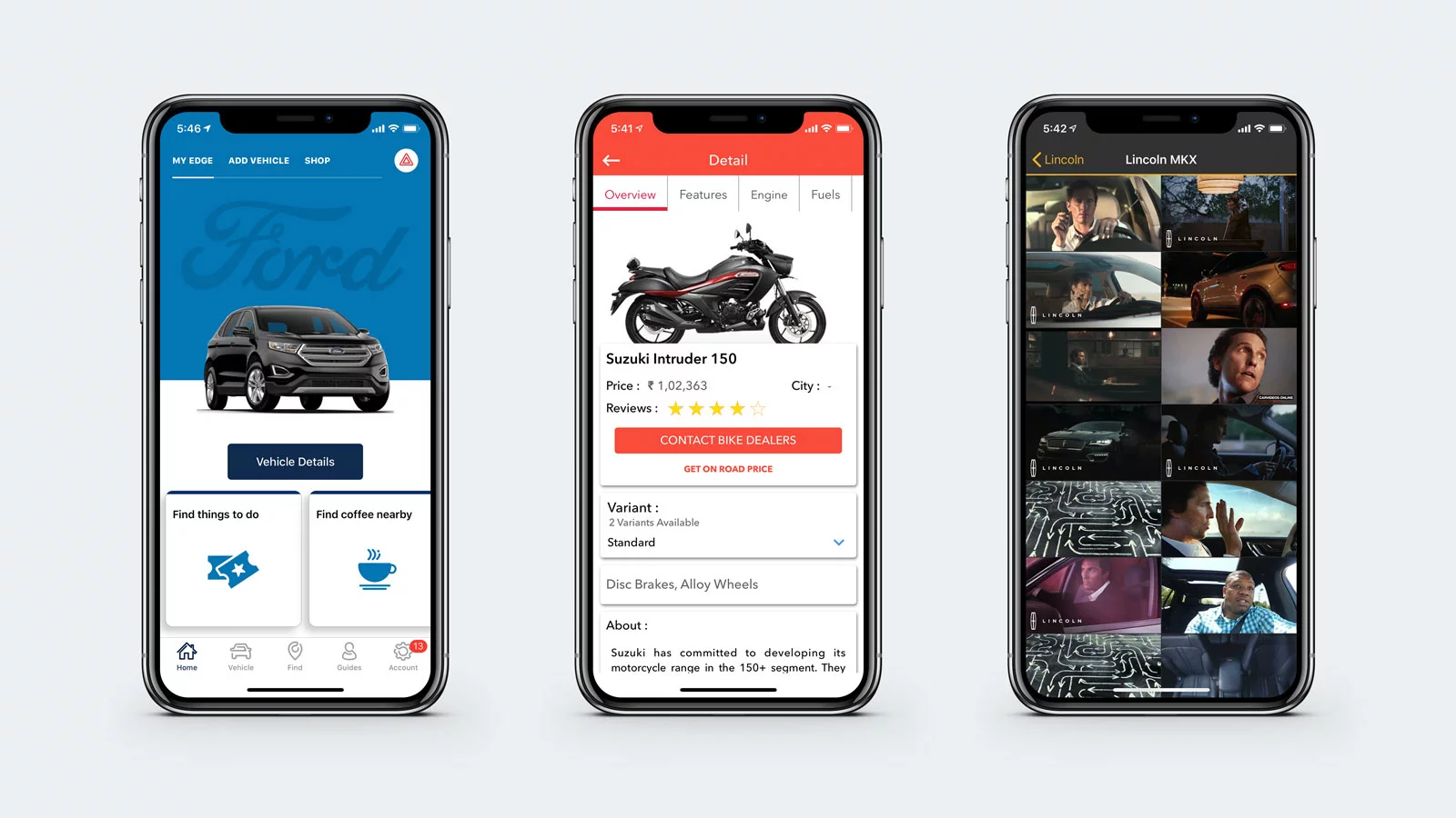
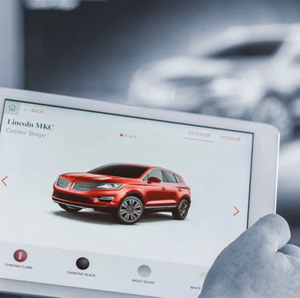
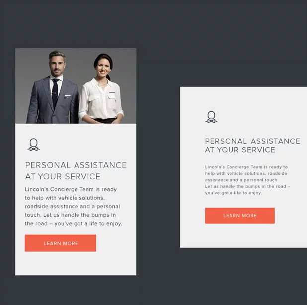
Final Phone Screens
Lessons Learned
This project reinforced the importance of user research in the design and development process. It highlighted the significance of responsiveness and the immediate feedback loop in the UX/UI design. Striking a balance between functionality and aesthetic satisfaction was a key responsibility, showcasing that users seek solutions that are both effective and visually pleasing.