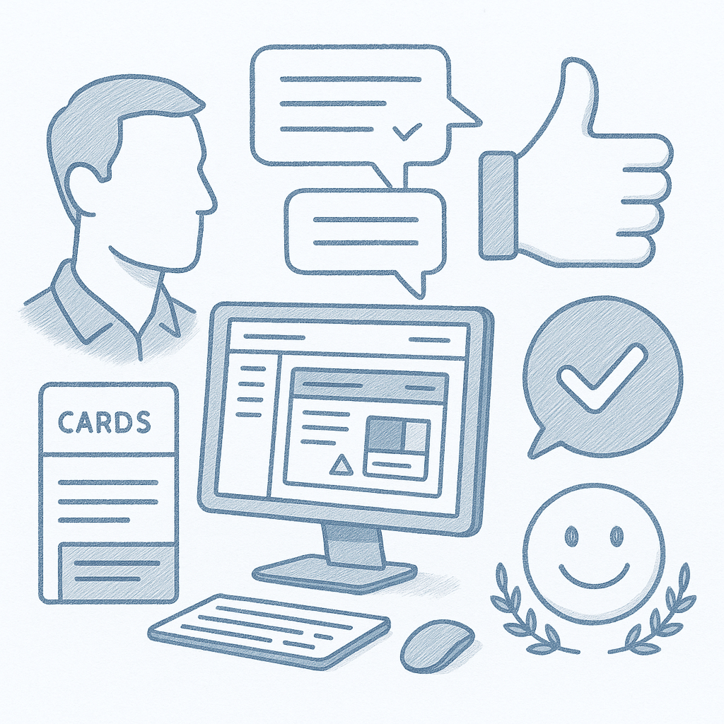
IA/Nav
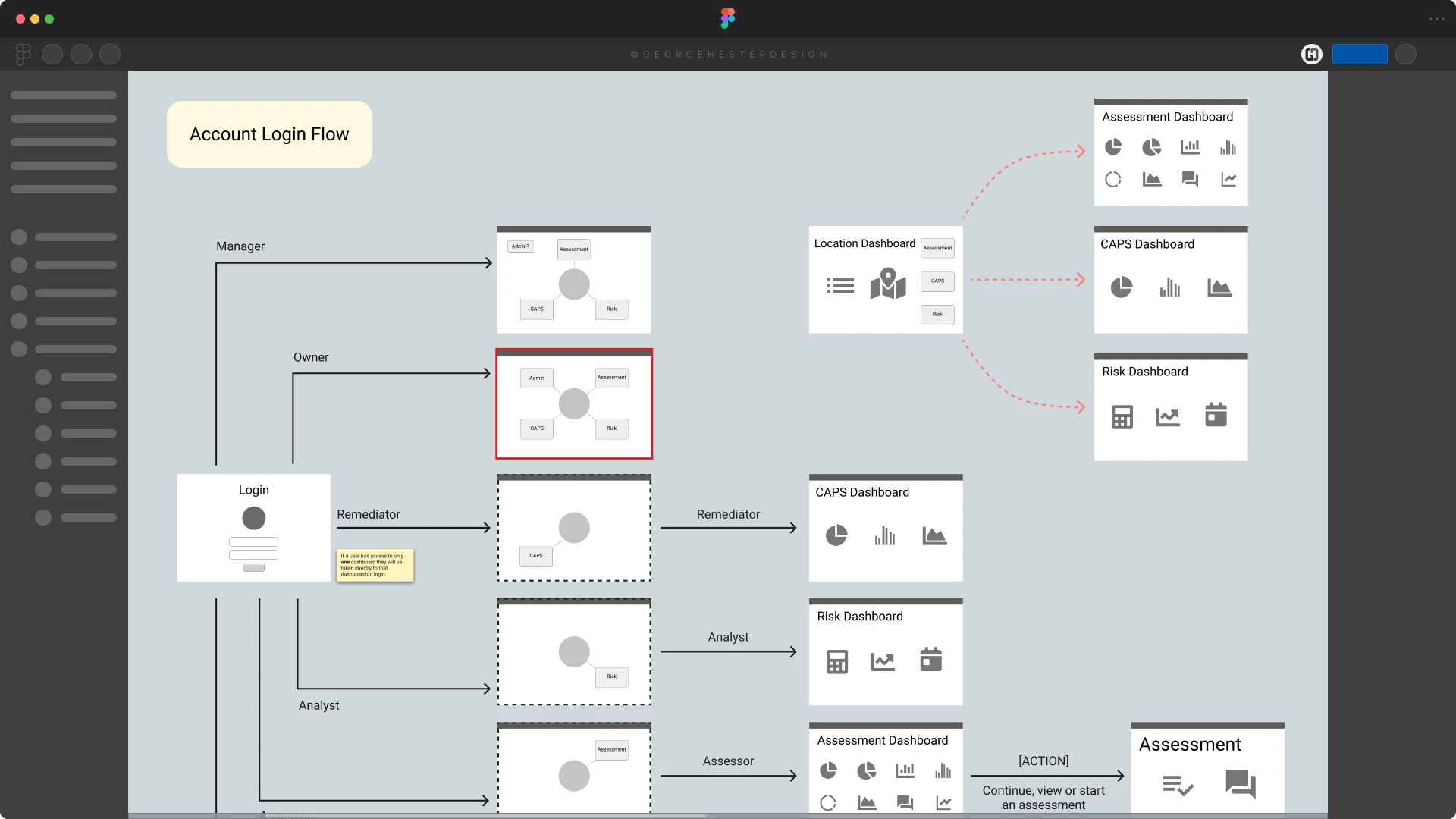
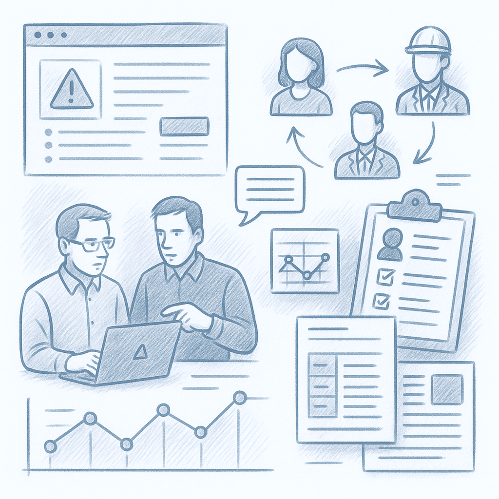
Dashboard User Flow
Circadian Risk is a platform for physical-security risk management. When I joined, the interface was built on a generic UI kit (Material UI) but lacked clarity, usability, and real-world polish — particularly for data-intensive tasks such as security assessments, risk reports, and compliance tracking.
My challenge: Turn a complex, cumbersome interface into an intuitive, efficient, and user-centered system that supports both detailed assessments and high-level overviews — without sacrificing power or flexibility.
My solution: Research how real security professionals work → redesign information architecture and dashboard flows → build a modular UI system → prototype, test, and iterate to deliver a platform that aligns with actual user workflows and mental models.
Detailed design files can be reviewed live during an interview process upon request.

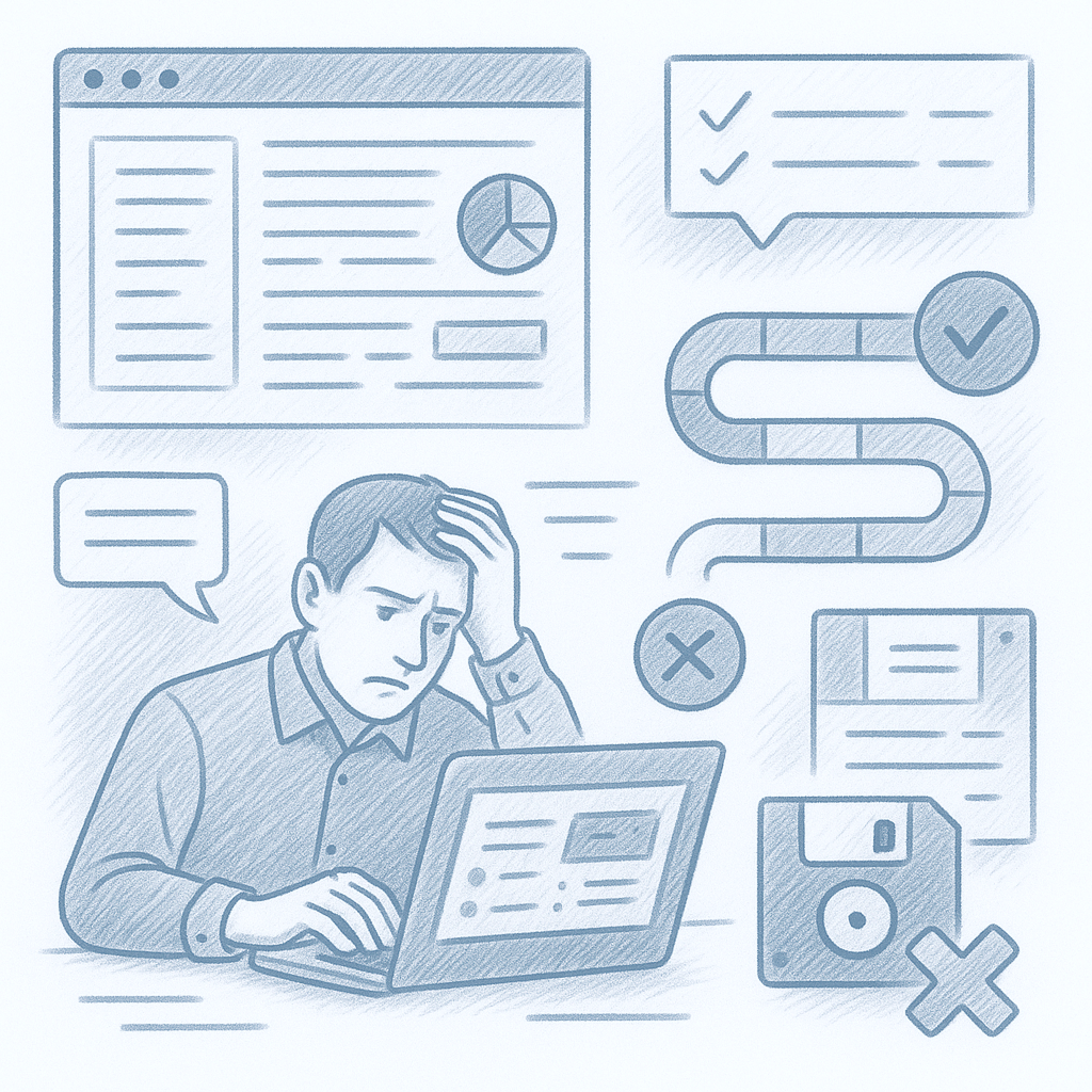
The original platform:
Core problem: Security experts needed a tool that reflects how they think — structured, modular, clear, data-driven — but the UI made their jobs harder, not easier.
Primary users: Security and risk-management professionals, often juggling compliance, threat analysis, hazard assessments, and reporting.
They require a system that supports:
Through interviews, demos, and workflow mapping, I distilled their needs, pain points, behaviors, and context — grounding design work in real user demands.
We began with a discovery phase:
We began with a discovery phase:
Based on our research, I defined three guiding principles:
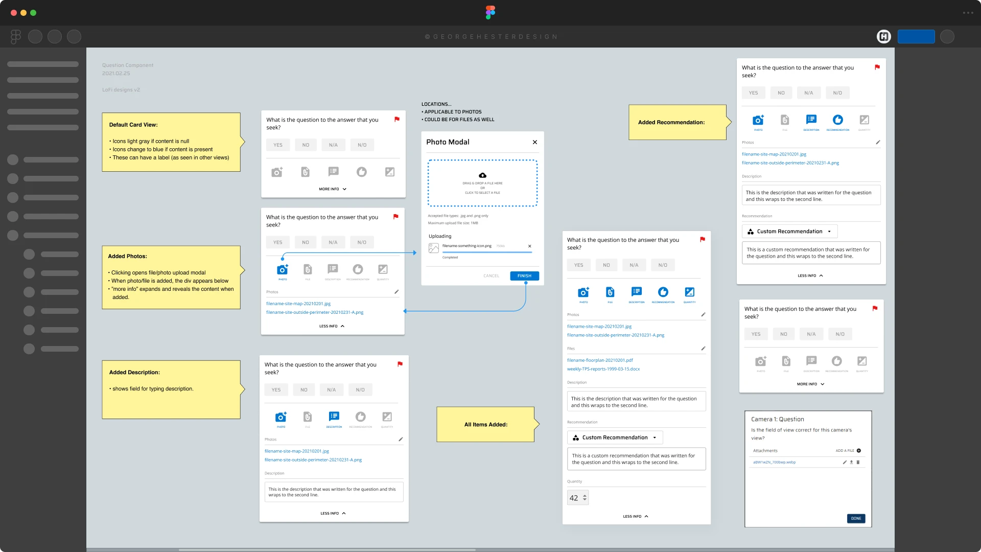
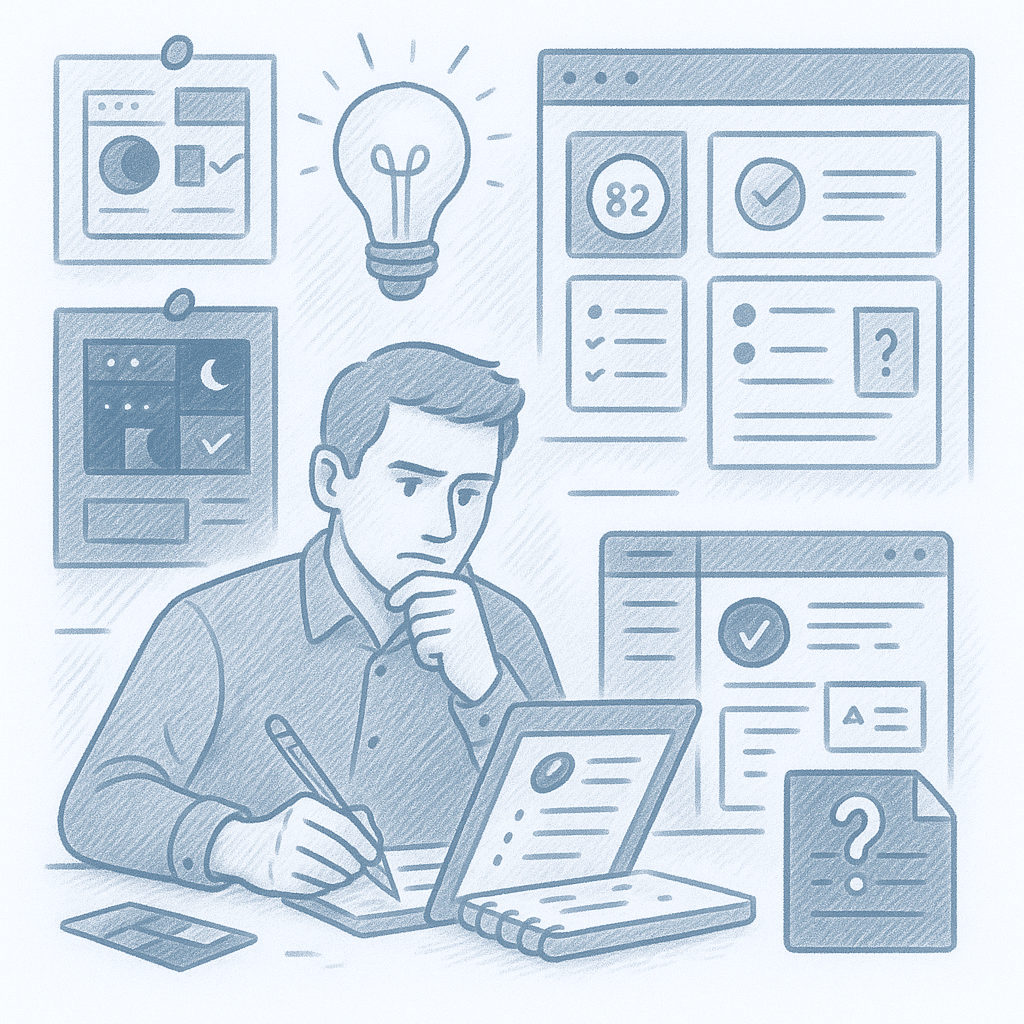
During ideation:
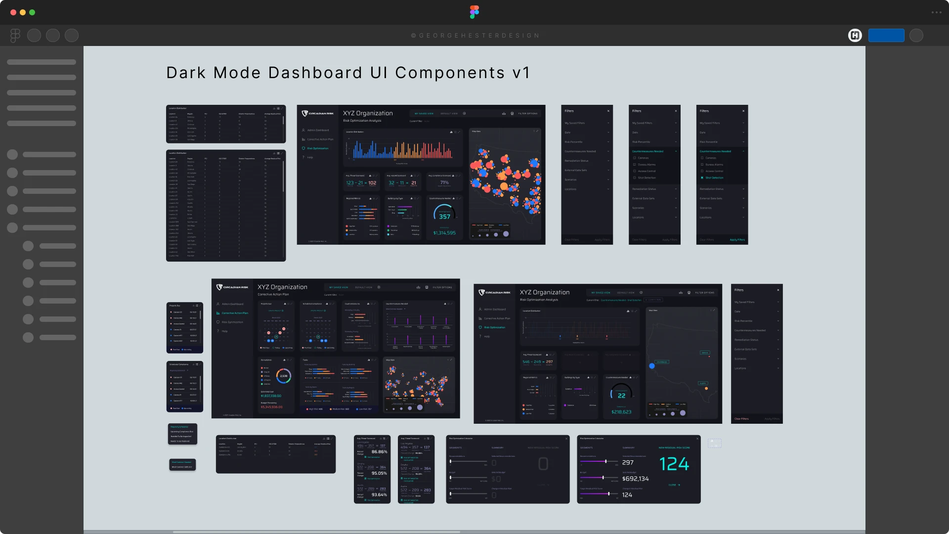
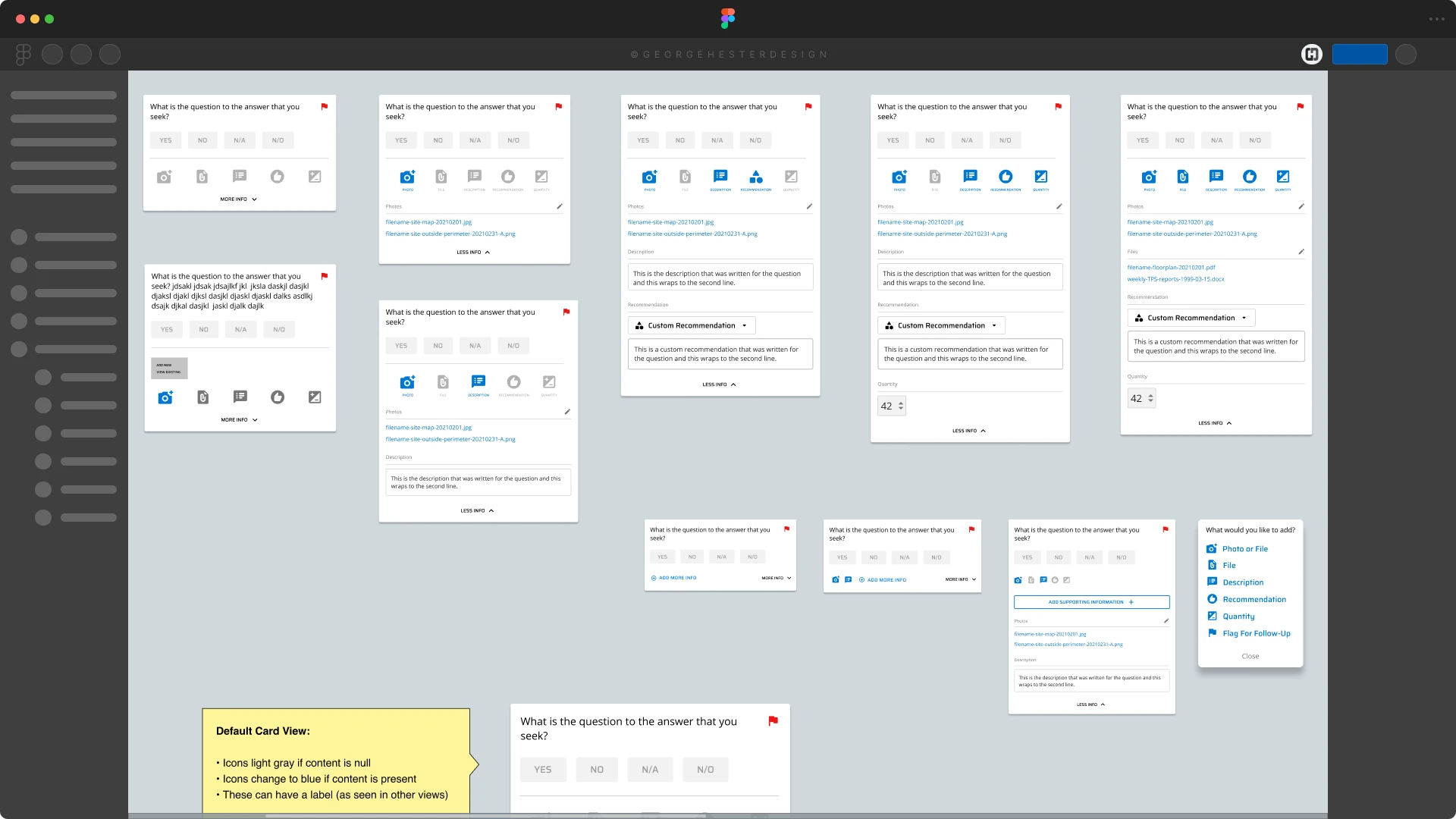
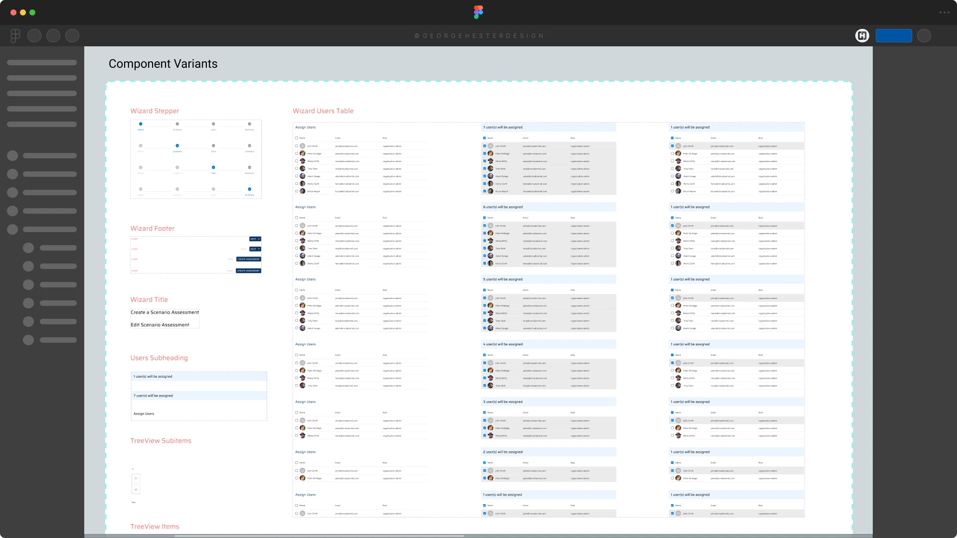
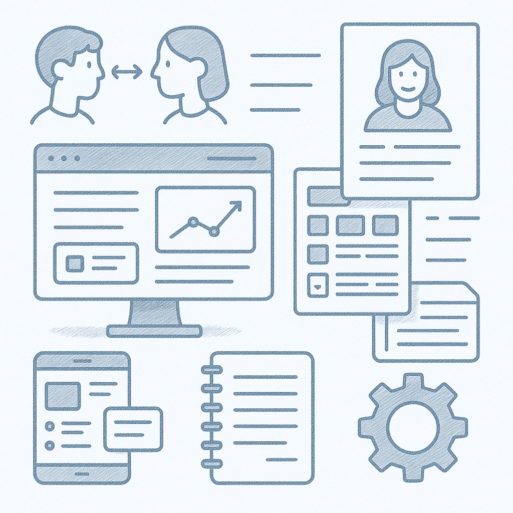
I built a full set of wireframes in Figma, covering:
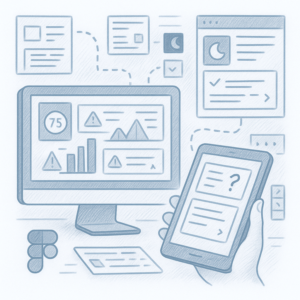
Then I turned the wireframes into an interactive prototype to test the flows, layouts, and data visualizations with actual users (security professionals)

I built a full set of wireframes in Figma, covering:

(Exact metrics and internal data are withheld due to client NDA. Detailed files and full visual assets are available for review during live interviews.)

This redesign for Circadian Risk transformed a difficult, cumbersome platform into a scalable, user-centered tool. By grounding the work in real user needs, simplifying layouts, and building a modular system, the final result supports complex security workflows with clarity and ease, proving that even data-heavy enterprise platforms benefit most from human-centered design.

Daniel Y."With George's talents in UX and UI design, he led the way in creating a new, more user-centric UI for our platform. He focused on making our design system better and always thought about how to make things work well on mobile. He put people at the center of his design work, making our platform easier to use and better than before. His eye for detail and drive for quality raised the bar for our team. Working with George was awesome, and his efforts have significantly advanced our platform's design and functionality.”