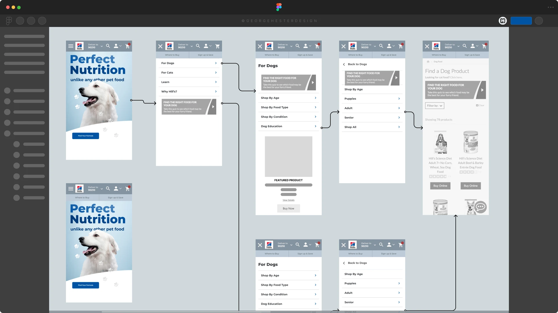
IA/Nav
Mobile Nav Concept
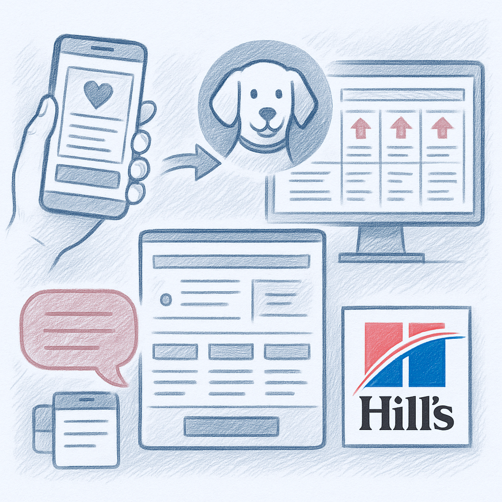
Hill’s Pet Nutrition needed to improve how pet owners find the right formulas, understand product benefits, and complete purchases through their preferred retailer channels. My focus was on simplifying the path from browsing to confident product selection by restructuring the information architecture, creating a clearer product comparison experience, and improving content hierarchy across key landing, PDP and PLP templates.
To comply with my nondisclosure agreement with VML, I have omitted and/or obfuscated confidential information in this case study. All information in this case study is my own and does not necessarily reflect the views of Colgate or Hill's Pet Nutrition.
Detailed design files can be reviewed live during an interview process upon request.
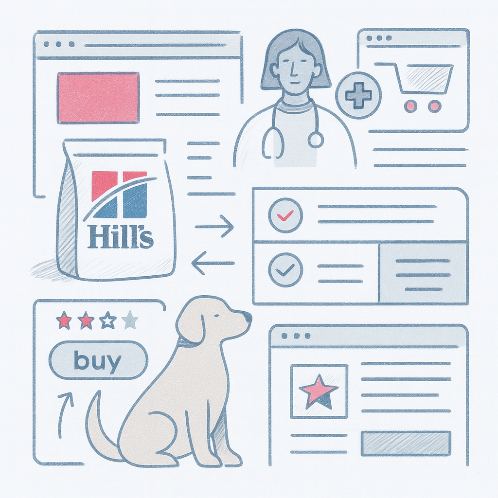
Pet owners often struggled to interpret differences between formulas, identify the correct nutritional solution for their pet, and understand the proper transition guidance. Existing templates contained dense content, inconsistent interactive components, and fragmented pathways to retailer checkout.
The core problem became clear:
People could not easily decide which formula was right for their pet or why they should trust it.

Stakeholders provided access to prior user insights and category learnings. From these, several consistent pain points appeared:
What we learned
(Raw interview notes and internal research are not shown due to NDA.)
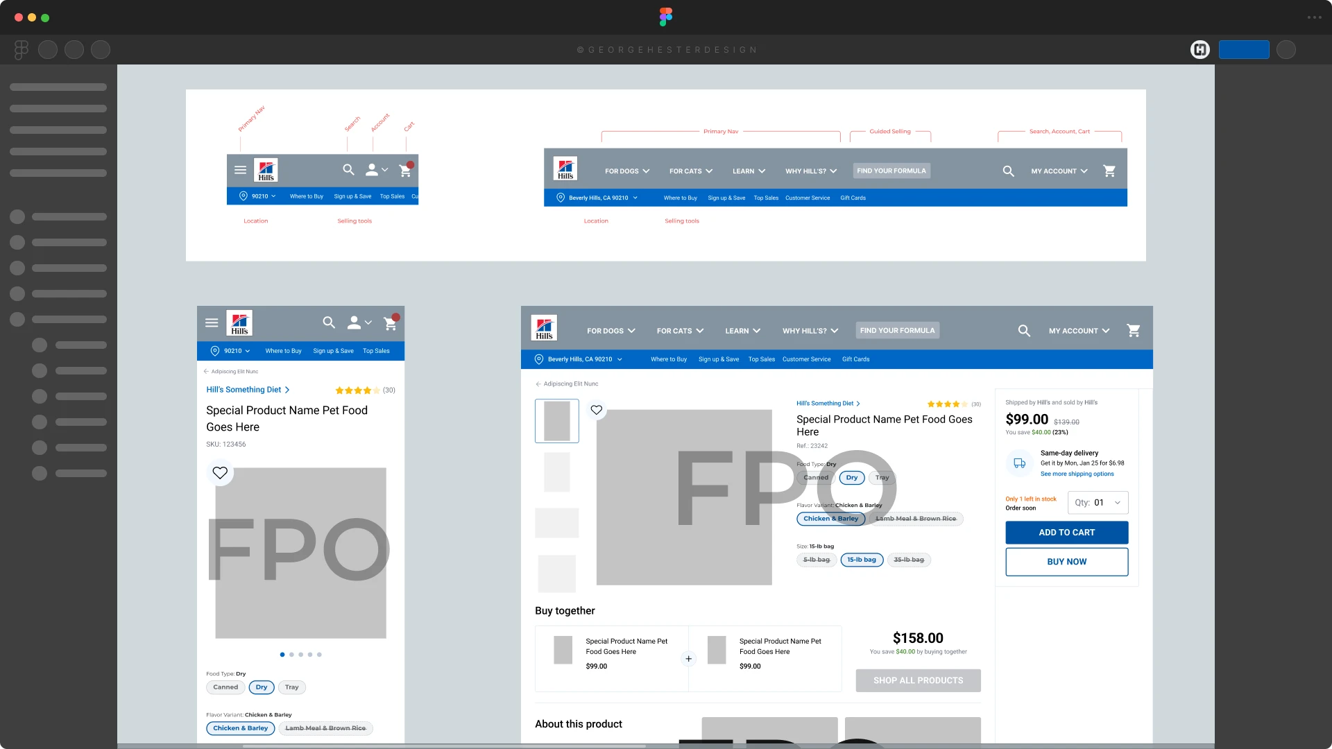
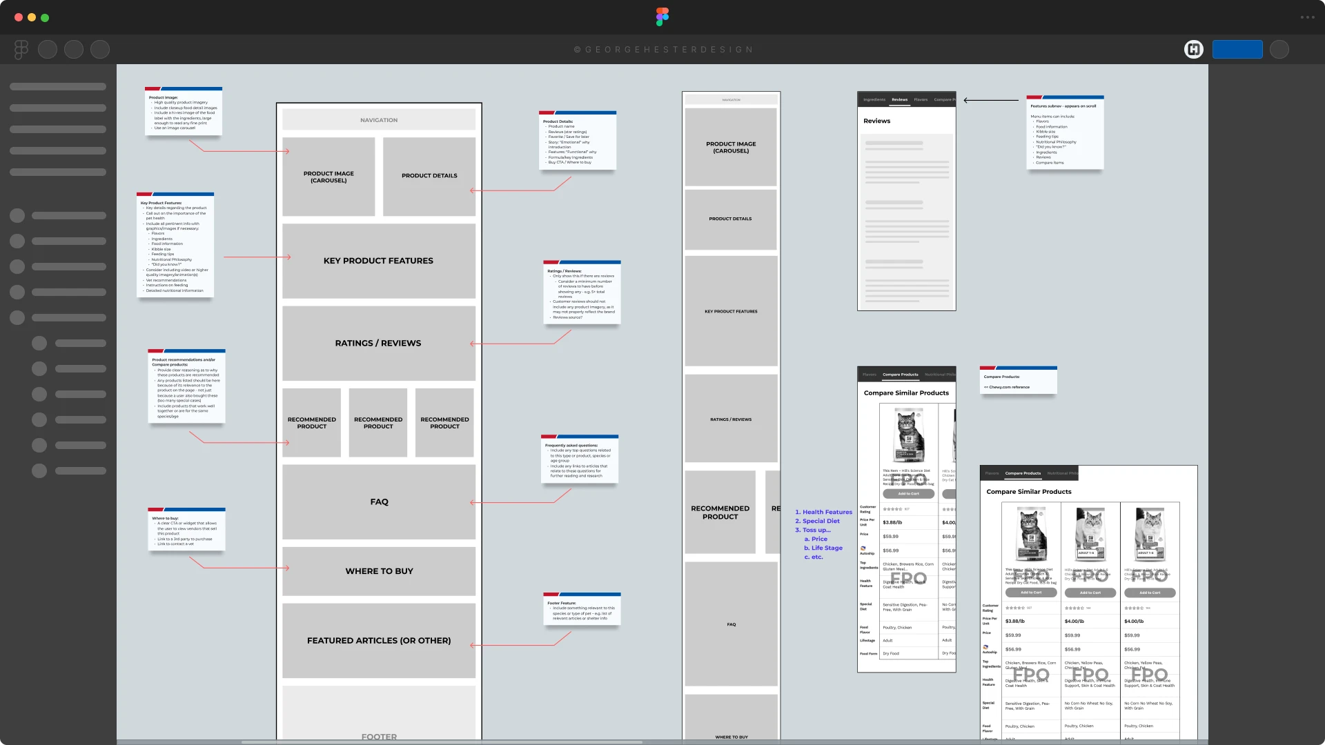
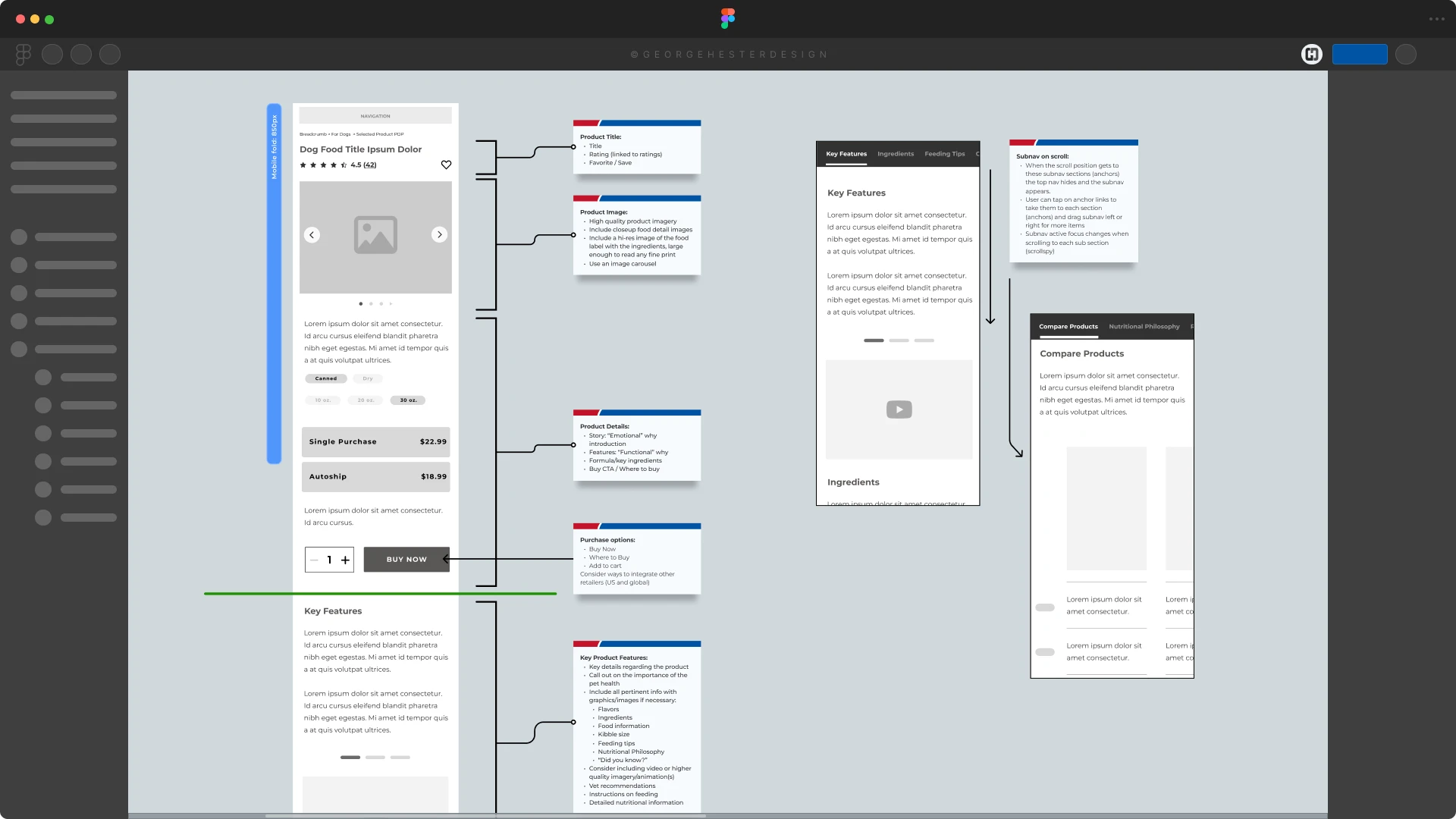
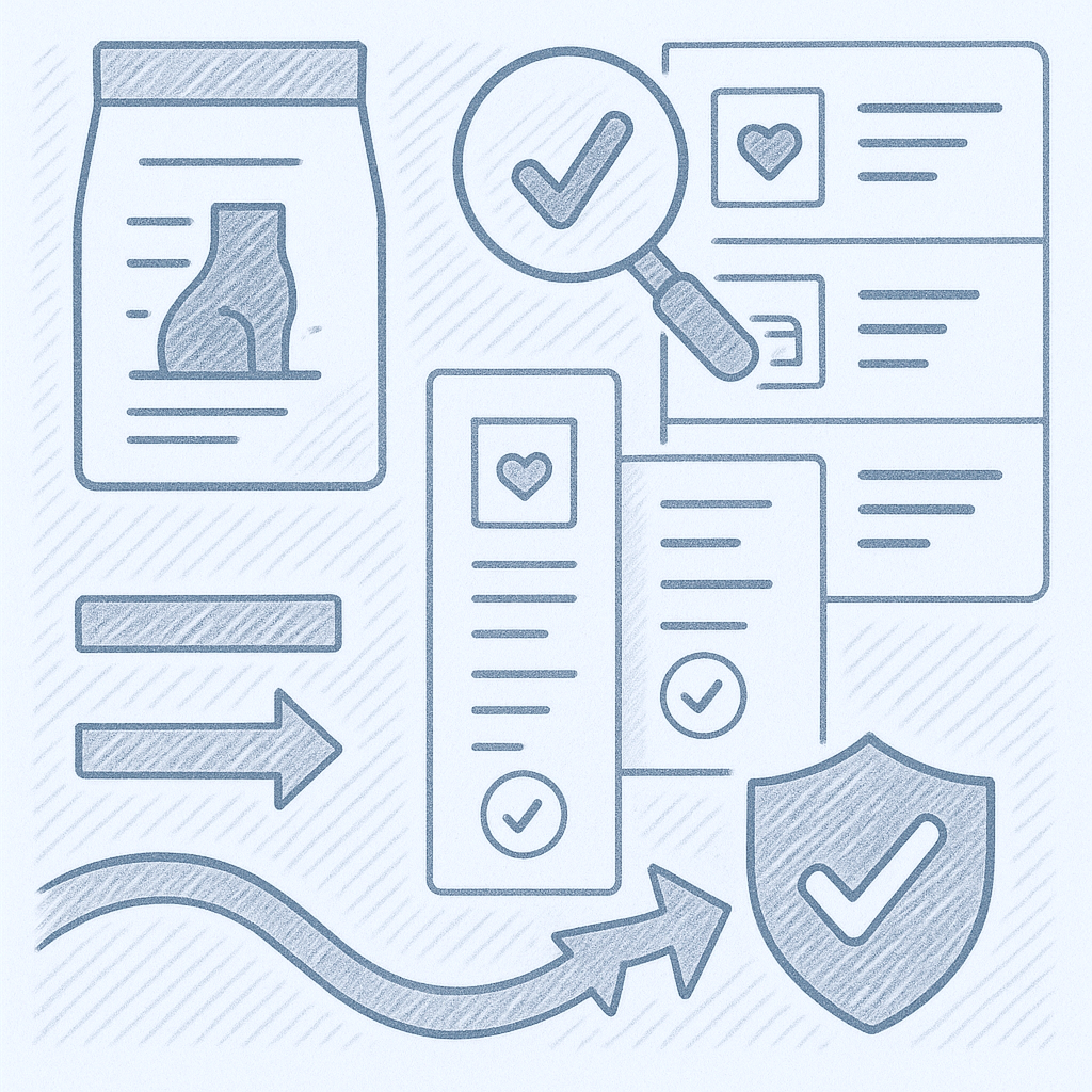
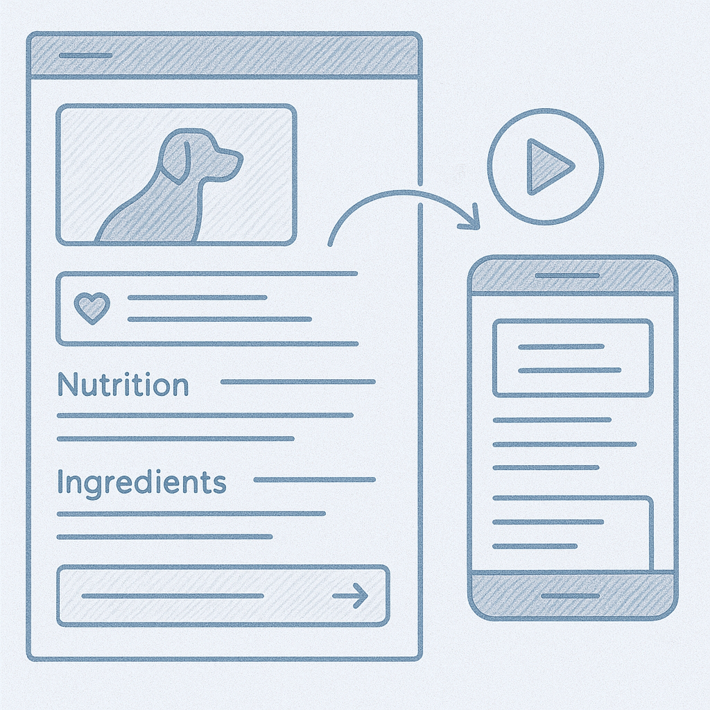
I rebuilt the core structure of the PDP to align information with how users make decisions:
This reframing provided a predictable mental model across the entire formula catalog.
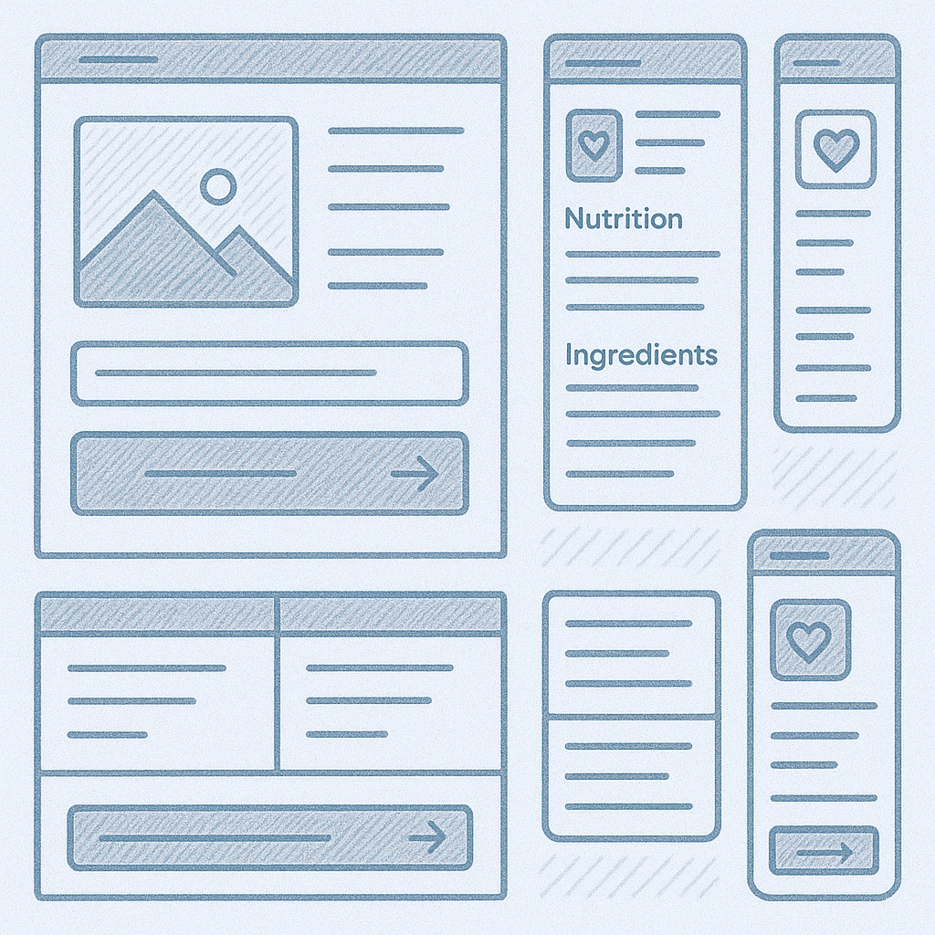
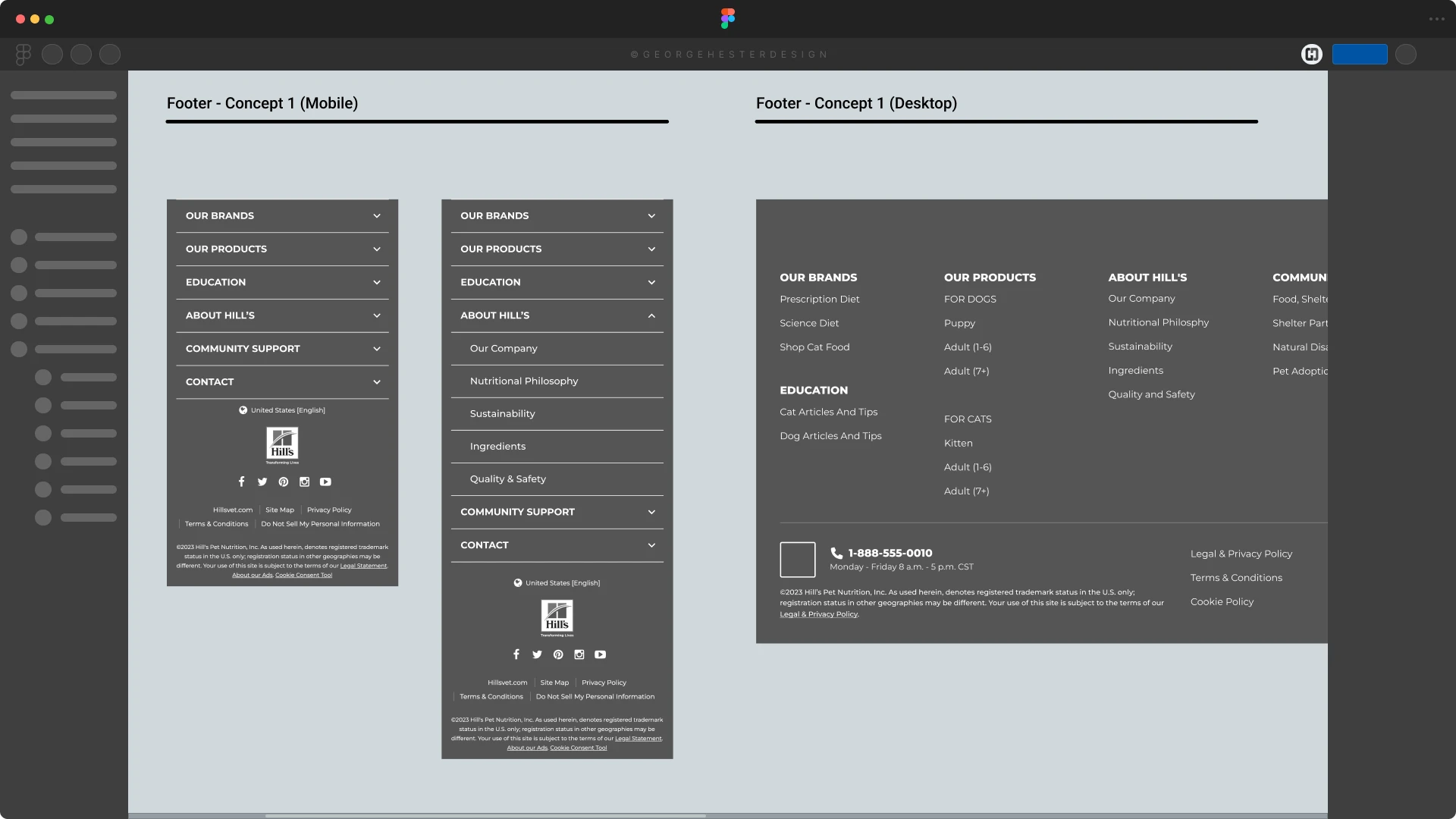
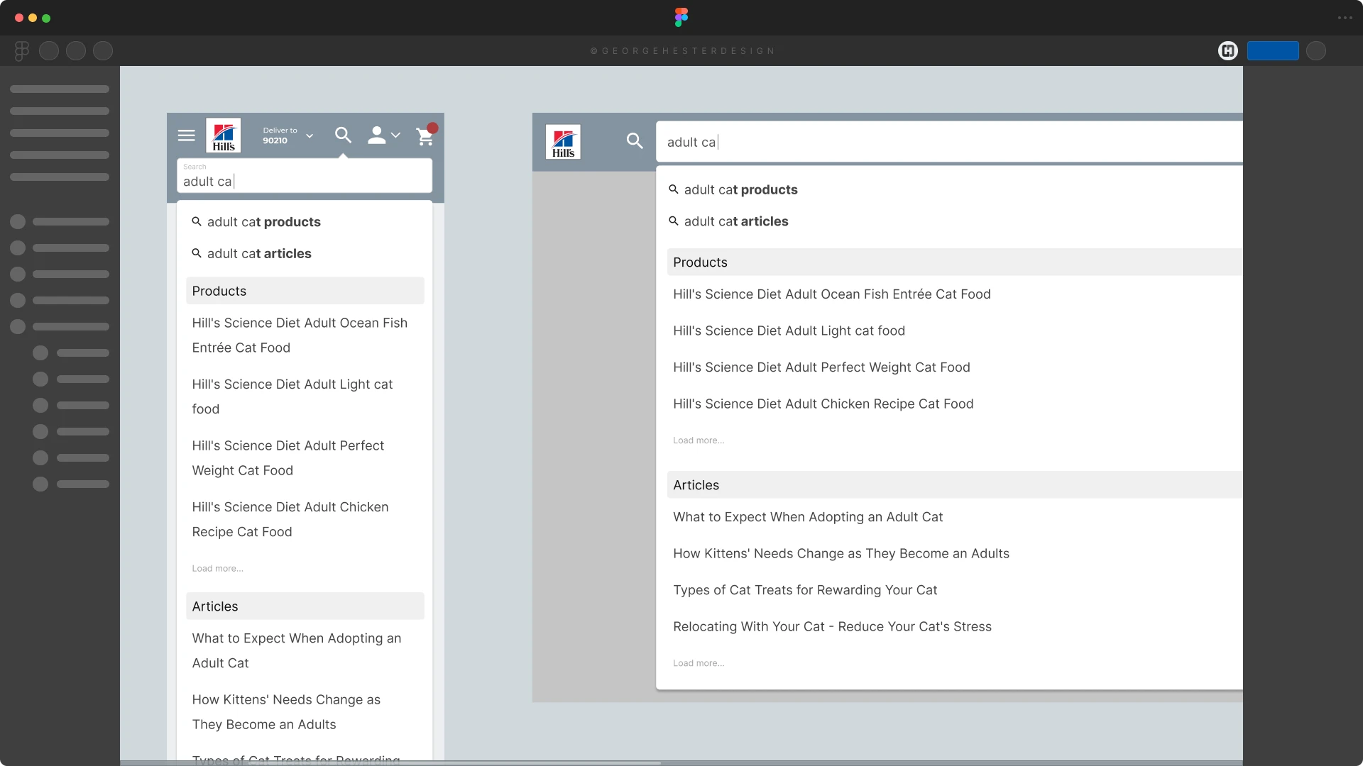
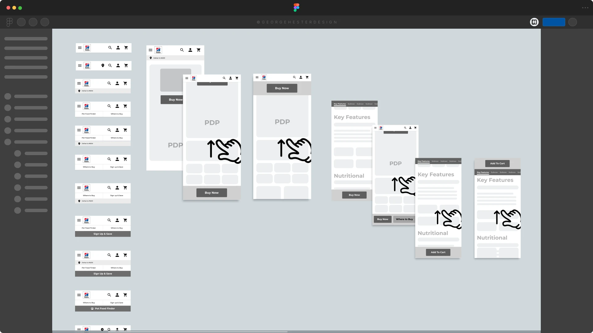
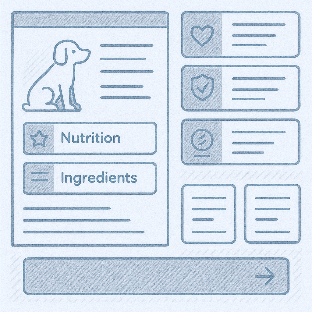
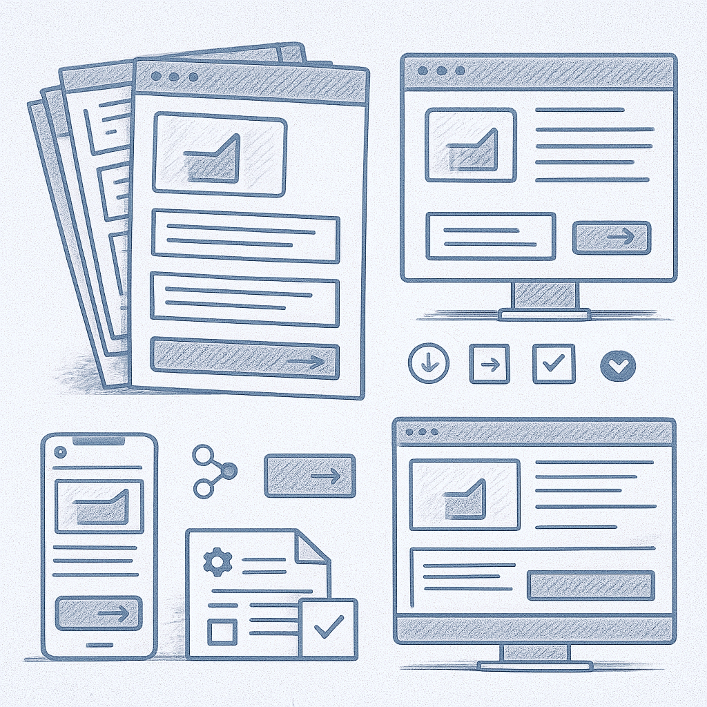
I created a full set of responsive wireframes covering:
These wires focused on hierarchy, clarity, and reducing cognitive load, ensuring veterinary details and nutritional facts were readable and structured.
(Some wireframes are not available publicly due to NDA, but can be reviewed and shared in a live interview setting.)

Throughout iteration, I focused on:
These decisions were validated through internal reviews and alignment sessions with cross-functional teams.
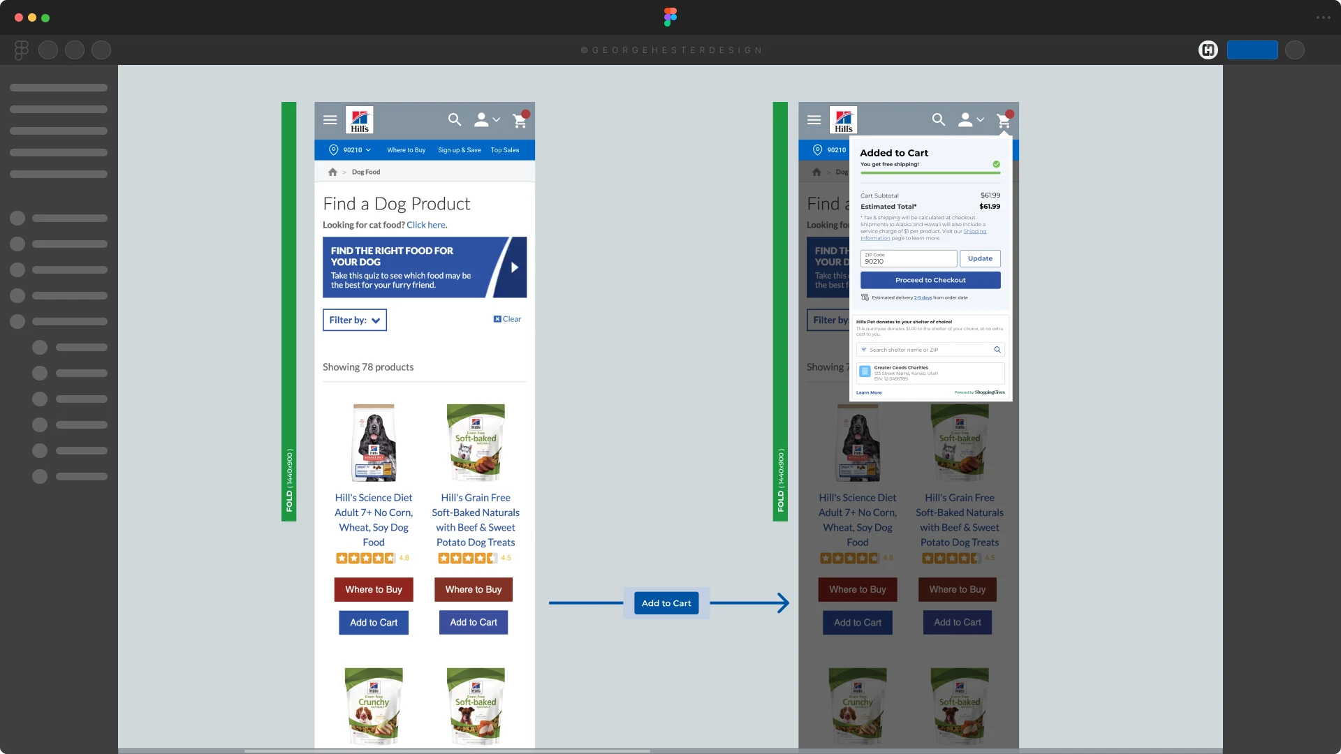
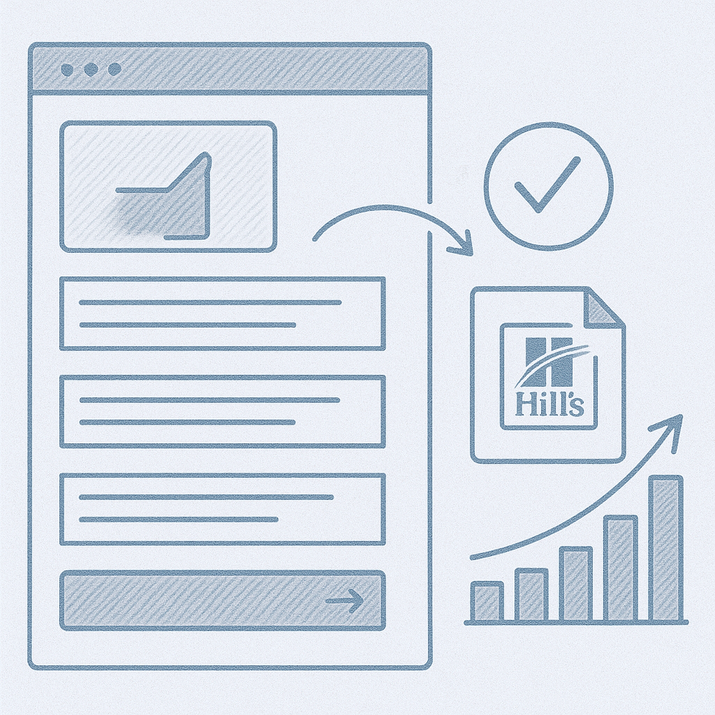
A complete responsive prototype was delivered, demonstrating:
Implementation and Launch: The concepts were approved by the client for further design and development, setting the stage for a transformative overhaul of the Hill's Pet online presence.
Because this work was part of a multi-phase modernization effort, I cannot share internal metrics.
However, outcomes included:
(Specific performance metrics are withheld due to NDA.)
(Specific performance metrics are withheld due to NDA.)
Limitations & NDA Notes: This case study illustrates our human-centered approach to addressing Hill's Pet Nutrition's challenge of declining website visitors. By focusing on user needs and preferences, we crafted a solution that promised to revitalize their online presence and provide a direct, personalized shopping experience.
Summary: This project strengthened the overall experience for pet owners seeking nutritional guidance and provided the foundation for more consistent future content. By focusing on clarity, scannability, and decision-support, the final system helped Hill’s create a more intuitive and trustworthy shopping journey across a broad catalog of formulas.
Manamai R."George's role as a Senior UX Designer showcased his diverse skills and innovative approach on the Hill's Pet Project. His attention to detail and seamless collaboration across teams contributed significantly to the project's success.”